Applying Heat Maps to Understand Customer Behavior
Introduction:
Customer expectations to have optimal experiences on today’s websites and mobile applications are soaring, and more and more customers are quick to abandon a site if they do not immediately find it engaging or cannot quickly locate what they are looking for. But, how do you know if your site is optimized to instantly engage customers and designed to readily meet their needs? How does click behavior differ on your site for those customers who abandon versus those who purchase? While web analytics can identify what pages your customers click on, applying usability analytics such as heat maps allows you to view where customers are interacting with your pages and understand customer behaviors for different segments. Armed with this increased insight, you are better equipped to implement design and layout changes to optimize your site, improve engagements and conversions and enhance customer experiences.
Analysis Overview:
A heat map overlay identifies regions of a page where customers either click or hover or hover to click. Heat maps are very useful in identifying high and low interest areas on a page and helping you recognize usability issues in the page design. By implementing heat map analysis available in IBM® Tealeaf® Customer Experience on Cloud (Tealeaf CX on Cloud), and applying dimensions to filter the report data by different segments of customers, you can understand where customers engage the most on your page and uncover design flaws that may be causing customer struggles – and abandonments --on your site.
Analysis Benefits:
Analysis Formula:
This customer experience analytics (CXA) formula will assist you with using heat maps analytics available in Watson CXA and IBM Tealeaf CX on Cloud to view and compare customer interaction rates on areas of a page to identify the content areas that are the most engaging to customers and the areas that may be causing struggles. The formula will then illustrate how applying dimensions to filter the data by different segments allows you to further evaluate customer behaviors and understand if your site design is optimal or if usability improvements are needed to enhance customer experiences and increase conversions.
View and compare customer interaction rates on a page
For this analysis, you will apply the heat maps overlay to a page snapshot. So, you will first want to:
1. Select a page snapshot to evaluate -- your home page, product page or even a campaign page would be good options – and select it from the Snapshot Gallery.
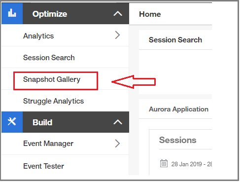 Navigate to Snapshot Gallery from the left navigation
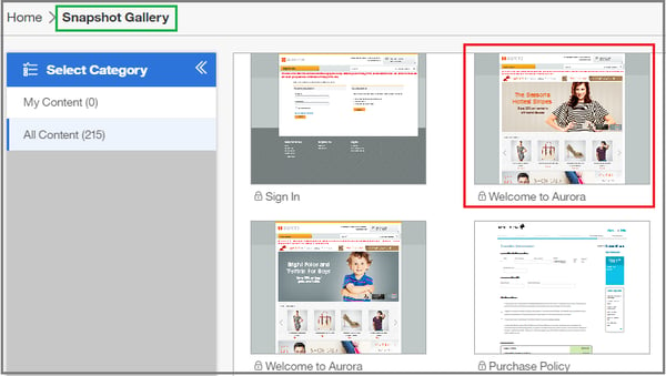 Select a page snapshot to evaluate from Snapshot Gallery
2. After selecting a page snapshot to evaluate, select Heat Maps from the list of available overlays, as shown below.
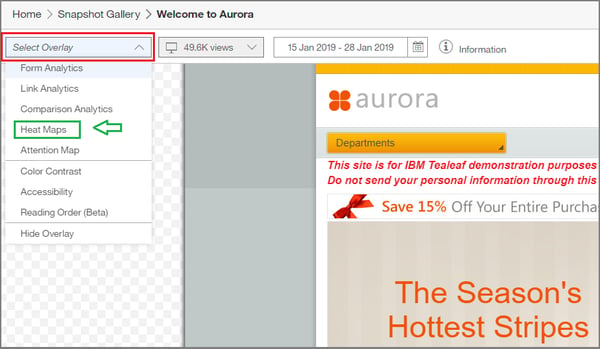
3. Select the magnifying glass icon from the top tool bar, as shown by red arrow in image below, to adjust the zoom and resize the page to ensure it is viewable on your screen, if necessary.
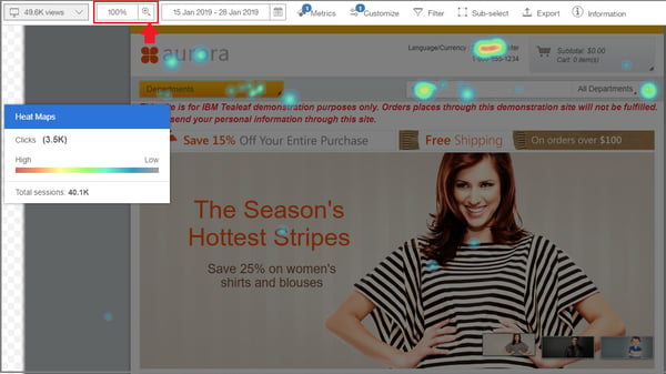 Example of Heat Map overlay applied to a page
In viewing the heat maps report, the red indicates areas of high customer interactions and the blue indicates areas of low customer interactions, allowing you to quickly view where customers are interacting with your page, as illustrated in the image below. Do you see a high number of customer interactions on areas of the page that you wouldn’t expect? Are most customers clicking where you intended with your page design?
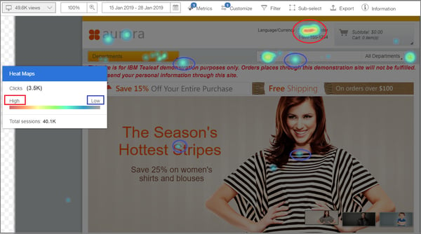 Heat Map overlay with high customer interactions indicated in red and low customer interactions indicated in blue
You will then want to further analyze the report data and quantify the number of customers who interacted with the particular areas on your page. To see the data summary for a specific area of the page:
1. Select the “Sub-select” tool in the Snapshot Galley to open a sub-select box, as shown in image below.
2. Drag the sub-select box over the area of the page you would like to investigate further. The sub-select tool will then display the data summary showing number of customers who clicked on the area you have selected, as shown in image below.
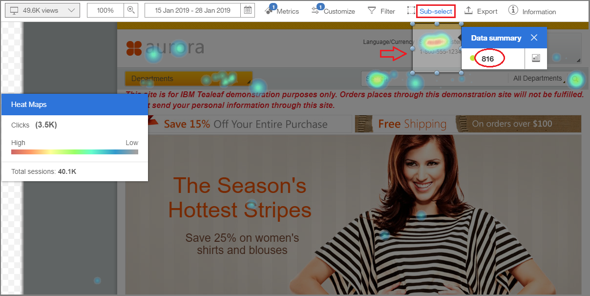 Heat Map report with data summary showing the number of interactions for selected area of page
3. Drag the sub-select box over additional areas of the page to compare data, as shown below
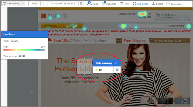
Heat map overlay with data summary displayed for customer interactions on center text
Comparing interactions with the number of customers who clicked on different areas of your page can help you identify if customers are clicking where you expected or intended on your page. For example, do you observe a lower click rate on your linked buttons or text? But, then discover a higher click rate on unlinked text? If so, perhaps there is a design flaw with your page that is causing customer struggle and confusion. By visualizing where customers click the most on your pages, you can optimize content and link placement to increase engagements and maximize conversions.
Use dimensions to filter and segment the data
The ability to apply dimensions and segment data offers you a deeper understanding of customer behavior relative to different segments and helps you identify where particular customers struggle and others succeed on your site. Applying dimensions to segment mobile customers and desktop web customers, for example, can help you recognize how each user is engaging with your pages and better understand how your page design may be impacting customer behavior for different segments – offering you the opportunity to optimize your site for all customers. Do you see higher interactions on your linked text for desktop web customers compared to mobile customers? Could some design changes make it easier for your mobile customers to find important information on your page? In addition, applying dimensions to your heat map data can also help you understand – and quantify -- if your page design is causing struggles that lead to abandonment. To do so, you can filter the heat map report data by those customers who interacted with a page and then abandoned the session without purchasing.
To apply dimensions to filter and segment your data, do the following:
1. Viewing the heat map overlay data report, select the filter icon on upper tool bar, as shown below, to see a list of dimensions for the data.
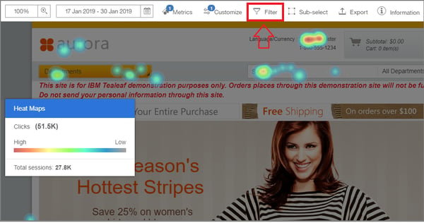
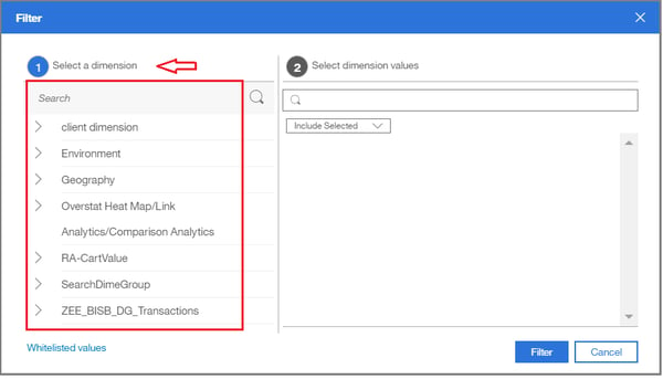 A list of dimensions for the data appears in the filter window
2. Select a dimension group in the filter window, as shown above.
3. Select dimension value(s) relative to the dimension group, as shown below.
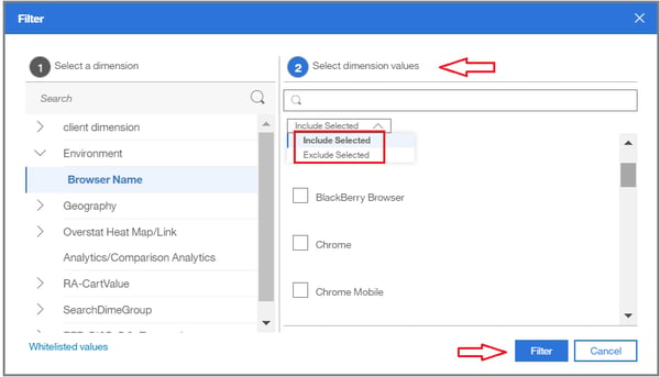
4. Click filter, as shown above, and the report snapshot updates to reflect the interactions of customers based on the filtered data, as shown below.
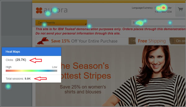 Report snapshot updated to reflect filtered data
5. To quantify the data, select the sub-select tool from the top menu and drag the sub-select box over the areas of interaction you want to evaluate. The updated data summary will appear, as shown below.
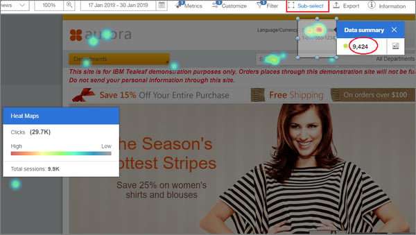
Applying usability analysis like heat maps allows you to easily see areas of high – and low – interest on your pages by identifying the intensity of customer interactions. Understanding where customers tend to focus on your pages can allow you to implement important design changes – like repositioning links on a page, redesigning a link button or modifying content placement -- that can directly improve brand engagement and increase conversions. Recognizing what content your customers are engaging with the most also offers you the opportunity to customize and make your pages more personal for your customers. Finally, on-going monitoring of customer interactions on your pages allows you to fine-tune and maintain optimal design elements and continually enhance customer experiences.
Need more information? Request a consult with us by clicking here.
Click here to go back to the Tealeaf on Cloud Use Case Formulas for Success main page.
