Customer Experience Analytics Formula Blog

Getting Started with Marketing Codes and Attribution Reporting

Posted by Steven Perry on Sep 19, 2017 7:00:00 AM

Introduction  

Understanding what influencers drive conversions across the marketing funnel is one of the important data points you can leverage to help drive your marketing campaign success.    Equipped with this valuable insight, you are able to better allocate your marketing resources and best align your marketing strategy to maximize opportunities.   In fact, the marketing attribution reports available in IBM Watson Customer Experience Analytics (CXA) can tell you a lot about what is driving your marketing campaigns – what marketing channels drive the most leads, what paid search terms perform the best, what key words do visitors associate with your brand, what websites refer the most traffic to your site, and more. 


Analysis Overview

In this analysis, we will share how to create the Marketing Management Center (MMC) codes that are used to generate marketing reports that can better inform you on the influencers -- marketing channels, programs, search and referring sites -- that are driving your marketing campaigns, allowing you to better refine your marketing strategy and maximize your marketing spend. 


Analysis Benefits

  • Create marketing analysis offering valuable and actionable insight on influencers that you can use to maximize the effectiveness of your marketing campaigns.
  • Utilize marketing insights to make better-informed decisions on how and where to invest your marketing resources to optimize your return on investment (ROI) and minimize wasted marketing budget.
  • Manage your marketing strategy's performance with increased efficiencies by identifying deficiencies and developing effective marketing processes.

Analysis Formula

This customer experience analytics (CXA) formula will demonstrate how to create the Marketing Management Center tracking codes (MMC codes) used in marketing program reporting in Watson CXA utilizing the Tracking Code Generator.   We will also highlight the marketing reports available that you can use to maximize your marketing efforts and increase your campaign performance.

Get started with marketing campaign analysis

As an entry point into marketing analysis for marketing programs, you can generate, format and append Marketing Management Center (MMC) tracking codes to your destination URLs to track off-site campaign links.  Data from the MMC tracking codes is used in the Marketing Programs report.   To reduce the possibility of error, you will want to create the Marketing Management Center (MMC) codes using the Tracking Code Generator. 

1. Download and install the Tracking Code Generator.

  1. Within IBM Digital Analytics, click Manage > Marketing > Tracking Codes.
    1. Note: Be sure to use the appropriate IBM® Digital Analytics service domain name for your organization.
  2. Launch the downloadable file to install the Tracking Code Generator. Once installation is complete, an icon will appear on your desktop.
  3. You can also access the Tracking Code Generator by clicking: Start > All Programs > IBM Digital Analytics >Tracking Code Generator.

2. Generate Marketing Management Center (MMC) tracking codes used in Marketing Program reports. You can specify marketing program attribute values to attach to the destination URLS for specific marketing programs (for example, cm_mmca1=).

  1. Open the Tracking Code Generator.
  2. Open the Excel file that you want to use, or download the template from the Marketing Program Codes tab of the Tracking Code Generator.
  3. Give your file a unique name and save it to your desktop.
  4. Add the destination URLs and parameter values to your file, then save the file (Refer to Diagram A below).
  5. On the Marketing Program Codes tab of the Tracking Code Generator, follow the on-screen instructions to select options for the marketing programs format, existing codes (if any) in your file, and advanced settings.
  6. Click Browse to select your Excel file.
  7. Click Create Codes, input a new unique file name for the output file, and save to your desktop
  8. If the file is successfully processed, a message displays, indicating the number of rows successfully processed.
  9. Open the Excel output file and you will see the MMC parameter appended to each URL. (Refer to Diagram B below).

                             Diagram A - Example:  Marketing Program codes input file

Marketing Attribution_image 1.png


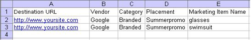
Diagram B - Example:  Marketing Program codes output file

Marketing Attribution_image 2.png

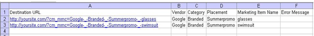
If any rows in your file contain an error message in column F, correct the error and use the Tracking Code Generator to reprocess the file. If column F is blank, the URL in the row is a valid MMC destination URL.

Note:  The Tracking Code Generator requires proper formatting of Microsoft Excel input files to generate tracking codes correctly.  Be sure to follow these guidelines when using the Tracking Code Generator:

  • Do not skip rows in between values. The Tracking Code Generator will stop processing when it encounters an empty row.
  • Include http://as part of the destination URL.
  • Do not include multiple worksheets in your Excel files. The Tracking Code Generator will not process an Excel file that contains multiple worksheets.
  • Use unique file names for the downloaded Excel templates, and for your input and output files (for example, 1.2013.xlsand MMC_output_9.1.2013.xls).
  • If you use special characters in your parameter values, ensure that the characters you use are supported in Digital Analyticsparameter values.


Recognize what is influencing your campaigns

As mentioned above, generating and appending MMC codes to your destination URLs creates data used in the Market Programs report that offers a comprehensive view of your online paid marketing activity and provides a good start to analyzing the performance of your marketing campaigns and links.   Using the Marketing Programs report, you can analyze marketing programs to improve the performance of content or creative placement, identify creative element within emails that generate the most click-throughs and transactions to enhance future emails, as well as analyze various paid search terms to improve the performance of existing keyword marketing placements, and more. 


Marketing Channels Report_1B.png

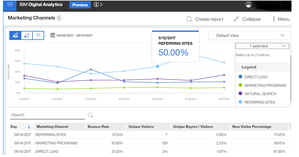
Additional acquisition reports available include the Marketing Channels report that provides a high-level overview of the referral sources or vendor channels that direct traffic to your website, allowing you to pinpoint those channels that are the most effective and identify those that may be adding little value to your business.   The Natural Search report identifies website traffic and conversion that results from natural search and helps you identify which keywords visitors associate with your brand, allowing you to refine your paid search marketing strategy and optimize ROI.   Finally, the Referring Sites report recognizes the websites that are referring traffic to your website so you can measure the value of this traffic and identify areas of opportunity or isolate areas for possible improvement.  

Collectively, the insight offered through the marketing attribution reports provides you with actionable data that you can use to better align your marketing strategy and optimize your campaign results.


Watson, Can you help improve digital experience ebook              Subscribe to CXA Blog


Topics: Customer Experience Analytics Formula, Marketing Codes and Attribution Reporting

Search Optimization Through Deeper Insight on Customer Engagement

Posted by Steven Perry on Sep 1, 2017 4:37:27 PM
Introduction

A great deal of time is often spent in developing content for websites and web pages, and effective content should quickly engage prospective customers and encourage their further interaction on your site. But, do you really understand if your customers find what they are searching for on your site? Do you know if the content you are offering is keeping them actively engaged on your pages?


Analysis Overview

While basic search metrics for click rates, CTA performance, multi-search, etc., can certainly give you a glimpse into customer engagement on your site, taking the metrics a step further with advanced search events and customized reporting can provide you with deeper insight into how engaged your customers are with your content and if they find what they are searching for on your site.


Analysis Benefits

  • Gain a deeper understanding of customer engagement on your web pages to help determine if your page content is effective and engaging for customers.
  • Provide insight that can assist you with optimizing search and improving content on your pages to increase customer experiences.

Search Optimization Graphic.png
Analysis Formula

This customer experience analytics (CXA) formula will outline how to create an advanced event to capture how long customers stay on a product page after a search or click through, and then build a customized report by search term and downstream user engagement to better understand if you are providing the right content to keep your customers actively engaged on your pages.

1) As you want to understand how long a customer stays on a page after they have clicked on an item after a search result or how long they stay on a page after they have clicked through to the page, you will need to create an advanced event. The advanced event should record the time customers spend on a product page after they have performed a search or click through.

For this example, we will illustrate an advanced event that fires ONLY IF the amount of time the customer spend on the product page is LESS THAN 20 seconds, as the purpose of this event is to fire when customers are not staying on the page that they clicked through to.

The advanced event should be structured in the following way to fire IF the noted conditions are met:

  1. //Search Results Page UNLOAD event exists in session
    //we need this to calculate the time spent on the page
    ($F.getEventCount("E_SEARCH_RESULTS_PAGE_LOAD_COPY_1488312064185") > 0
  2. //Search Results Page LOAD event exists in session
    //we need this as well to calculate the time spent on the page
    && $F.getEventCount("E_SEARCH_RESULTS_PAGE_LOAD_1488311781932") > 0
  3. //Last Referrer URL includes /search/
    //checks that this page was referred to by a search page
    && $S["SSV_1111"].toUpperCase().indexOf("/SEARCH/") >= 0 
  4. //Last Referrer URL includes ?terms=
    //checks that the referring search page contains a search term
    && $S["SSV_1111"].toUpperCase().indexOf("?TERMS=") >= 0
  5. //checks if the number of seconds from page LOAD to page UNLOAD is less than 20
    && ($F.getLastEventNumericValue("E_SEARCH_RESULTS_PAGE_LOAD_COPY_1488312064185") - $F.getLastEventNumericValue("E_SEARCH_RESULTS_PAGE_LOAD_1488311781932")) < 20)

IF all of the above conditions are met, the event will fire and record the time spent (i.e., less than 20 seconds) on the product page.

2) Next, build a customized report that will allow you to better understand the relation of search term and the amount of time (i.e. time under 20 seconds, in this example) that customers spend on your product page after they have searched or after they have clicked through.

In order to appropriately build and segment the report, you should do the following:

  1. As the underlying event that captures the search term is “Event Value Terms,” create a dimension out of this event called   “QueryString Value.”
  2. Then, place the dimension “QueryString Value” in the dimension group “QuerySearch.” By adding this dimension group to the advanced event, you are then able to segment the report by search term

 Watson, Can you help improve digital experience ebook              Subscribe to CXA Blog


Topics: Customer Experience Analytics Formula, Search Optimization

Applying Geospatial Analysis for Geographical Insight into your Data

Posted by Steven Perry on Jun 27, 2017 7:00:00 AM

Introduction

Developing a complete view of your customers is critical in today’s competitive environment where it is essential to understand how customers are interacting with your business and why particular customer behaviors may be recognized on your site.   By expanding your reach with geospatial analytics available in Watson Customer Experience Analytics (CXA), you can now also understand where geographically customers are engaging or struggling with your organization, allowing you additional insight to make more informed and targeted decisions about your business on a global level.


Analysis Overview

By applying geo analytics to your reports, you can understand how your business is performing across geographical areas, allowing you to identify particular areas that may require improvement or adjustments and overall enabling you to maximize wide-scale business opportunities.


Analysis Benefits  

Geospatial analysis can be applied to many use cases to help identify geographical areas for improvement and assist with targeting key areas to maximize potential opportunities.   Some business examples could include:   

  • Examine online abandonment rates by state to remarket to customers with a targeted campaign or promotional offer for additional savings at a local storefront.
  • Evaluate error conditions or struggle indicators like broken pages by country for global operations to deploy necessary site improvements.
  • Assess mobile traffic by city, state or zip code to inform your mobile strategy, optimize mobile site design and/or develop improved mobile applications.
  • Review marketing landing page traffic by country or region to understand campaign effectiveness by geography and identify potential areas for campaign improvement.


Analysis Formula

This customer experience analytics (CXA) formula will assist you with applying geo analytics to event reporting available in Watson CXA to understand how your business is performing across states, regions or the globe.   At the same time, the formula will illustrate how to set a threshold to measure geo analytics data by positive or negative performance, as well as drill down into particular sessions, as appropriate, to visualize customer experiences for increased optimization.

This analysis is flexible and you should apply geo analytics to the event reports that are most important to your business goals or most relevant to your key performance indicators (KPIs).

Create a Geo report to begin to evaluate your data from a geographical view

Just as events populate reports, the Geo reports populate event data based on the location of a customer’s device or machine.

Step 1
To create a Geo report, navigate to the Event manager to either build an event or modify an existing event for geo analytics.
  1. The event you build or the event you select to modify will depend, of course, on what data you want to evaluate on a geographical level. Any event that you would like to evaluate on a geographical level can be created or modified for geo analysis.
  2. Looking at our example scenarios, you could build or modify an existing event tracking hits to particular website pages or to marketing landing pages you may have developed to support a campaign. Or, you could create or select an existing event tracking mobile interactions on your site or build an event to record online abandonments, as examples.         
Step 2
Once you have created an event or selected an event to modify, you can enable the event to collect geo analytic data by simply scrolling to the bottom of the event’s configuration, and then selecting the ON switch for Geo Analytics.
  1. When the geo analytic-enabled event is saved, you can use the event in geo analytic reports OR in standard reports using geo analytics as breakout values.
  2. Similarly, you can also enable dimensions for geo-analytics and integrate the dimensions as a breakout in a report.
  3. Using the Geo out of the box dimension groups, you can segment report data by continent, country, state or city.                                                                                                                            
Step 3
From an open Workspace, select “Add Widget” and select “Create Report.” From there, select “Geo report.”
  1. From the Geo report screen, select an application’s profile in the upper right. You could be monitoring both a mobile application and a desktop website for your business.
  2. Next, select a timeframe to populate report data You can select a fixed data range OR select to keep your report updated with rolling date ranges. 
  3. Finally, click “metrics” and then “add metrics.” An “add metrics” screen is displayed.  As Geo reports can be populated by multiple metrics, you can select the metric or metrics to be used in your report.
    1. From the metrics selector, you can select the metric by filtering by the tag that was assigned to the metric OR select the metric by using Search. For example, in the first use case on examining online abandonment rates by state, you could search by the word “abandonment” and then select the applicable event that was created to capture abandonments in reporting.
  4. When the correct event or events are highlighted and then applied from the metric selector, the Geo report is then displayed.

Apply thresholds to identify negative and positive event performance in Geo reports


Geo reports can track both positive and negative performances of events.  To identify positive and negative events in the Geo report, you can set a threshold to analyze geo analytics data.   The threshold value determines at what value we establish the geo report as positive (or healthy) or establish the geo report as negative (or critical).   

Step 1
From the displayed Geo report, select the “summary” tab from the upper right. A dashboard appears showing the “average” value of the mapped data, as well as the highest value and lowest value of the mapped data.   
  1. Looking again at our first scenario on examining online abandonment rates by state, for example, the dashboard will show the state with the highest frequency of abandonments and the total number of abandonments for that state, as well as display the data for the state with the lowest rate of abandonments and identify the average number of abandonments across the Geo report data.
Step 2
After reviewing the dashboard data, select the “threshold” indicator in the lower left. From the threshold indicator box, you can select to measure a positive performance or select to measure a negative performance.   Again using our example of abandonment rates by state, we would select to measure a negative performance, as we are populating our Geo report to track abandonments.                                  
 
Step 3
Finally, insert the threshold value to be used in your Geo reporting.
  1. While you can select any value for your threshold, it is helpful to consider the data in the summary dashboard when selecting your threshold value.  For example, if we again refer to our first use case, if the state with the highest rate of online abandonments includes 660 abandonments, we could use half of that number, or 330, to start out as our threshold indicator.
  2. You should consider KPI’s and performance goals assigned to your business when selecting the appropriate threshold value to include in your Geo reports.    

                              Geospatial image_test cut.jpg

Example:  Geo report with threshold values applied


Step 4
After applying the threshold value, the Geo report is updated to reflect positive or healthy performance in green. When numbers exceed the defined threshold, the numbers are displayed in red for negative or critical performance.
  1. The ability to view data in a Geo report allows you to quickly understand how business goals are performing across geographical areas and to easily identify geographies, regions, states or even cities where your business may require improvements, adjustments or enhancements.
    1. Did your campaign landing pages show critical performance in one or two countries compared to healthy performance reflected in 5 or 6 additional countries? What contributed to the poor performance in particular countries?
  2. Using replay capabilities available in Watson CXA, you can drill down into sessions from areas where a critical performance is identified in the Geo report and visualize what struggles or obstacles may be contributing to the negative results.
    1. Were campaign landing pages slow to load in critical performing countries? Did a design flaw on the landing page cause customers to struggle?    Geospatial analysis complemented with replay capabilities in Watson CXA can help you identify poor performance in select geographical areas and assist with visibility into the necessary improvements.

Geospatial analytics offers additional insight into your data and helps you better understand how your business is performing across countries, regions, states and even cities.   The observations from Geo reports can help you realize how promotional campaigns, render times, abandonments and more measure up across the globe, allowing you to reach beyond transactional data into locational information that can identify geographic trends and assist with making better business decisions to maximize global opportunities.  

 Su

Topics: Customer Experience Analytics Formula

Applying Heat Maps to Understand Customer Behavior

Posted by Steven Perry on May 30, 2017 7:00:00 AM

Introduction

Customer expectations to have optimal experiences on today’s websites and mobile applications are soaring, and more and more customers are quick to abandon a site if they do not immediately find it engaging or cannot quickly locate what they are looking for.   But, how do you know if your site is optimized to instantly engage customers and designed to readily meet their needs?   How does click behavior differ on your site for those customers who abandon versus those who purchase?  While web analytics can identify what pages your customers click on, applying usability analytics such as heat maps allows you to view where customers are interacting with your pages and understand customer behaviors for different segments.   Armed with this increased insight, you are better equipped to implement design and layout changes to optimize your site, improve engagements and conversions and enhance customer experiences.


Analysis Overview

A heat map overlay identifies regions of a page where customers either click or hover or hover to click. Heat maps are very useful in identifying high and low interest areas on a page and helping you recognize usability issues in the page design.  By implementing heat map analysis from Tealeaf cxOverstat available with IBM Watson CXA, and applying dimensions to filter the report data by different segments of customers, you can understand where customers engage the most on your page and uncover design flaws that may be causing customer struggles – and abandonments --on your site.   


Analysis Benefits

  • Identify content areas on your pages that are of the most interest to customers and areas that may be causing confusion or struggles on your pages.
  • Uncover usability and design flaws on your site for increased visibility into areas requiring improvements and fine-tuning.
  • Facilitates optimal design elements that can improve engagements, maximize conversions and optimize customer experiences.


Analysis Formula

This customer experience analytics (CXA) formula will assist you with using heat maps analytics available in Watson CXA to view and compare customer interaction rates on areas of a page to identify the content areas that are the most engaging to customers and the areas that may be causing struggles.   The formula will then illustrate how applying dimensions to filter the data by different segments allows you to further evaluate customer behaviors and understand if your site design is optimal or if usability improvements are needed to enhance customer experiences and increase conversions. 


View and compare customer interaction rates on a page

For this analysis, you will apply the heat maps overlay to a page snapshot.  So, you will first want to:

  • Select a page snapshot to evaluate -- your home page, product page or even a campaign page would be good options – and select it from the Snapshot Gallery.
  • Select Heat map report from the list of available overlays.
  • Select the magnifying glass icon from the top tool bar to adjust the zoom and resize the page to ensure it is viewable on your screen, if necessary.

Heat Map Image_1.png                                                  Example of Heat map overlay applied to a page


In viewing the heat maps report, the red indicates areas of high customer interactions and the blue indicates areas of low customer interactions, allowing you to quickly view where customers are interacting with your page.    Do you see a high number of customer interactions on areas of the page that you wouldn’t expect?    Are most customers clicking where you intended with your page design?

You will then want to further analyze the report data and quantify the number of customers who interacted with the particular areas on your page.  To see the data summary for a specific area of the page:

  1. Select the “Sub-select” tool in the Snapshot Galley to open a sub-select box
  2. Drag the sub-select box over the area of the page you would like to investigate The sub-select tool will then display the data summary showing number of customers who clicked on the area you have selected.
  3. Drag the sub-select box over additional areas of the page to compare data.

Comparing interactions with the number of customers who clicked on different areas of your page can help you identify if customers are clicking where you expected or intended on your page.   For example, do you observe a lower click rate on your linked buttons or text?   But, then discover a higher click rate on unlinked text?   If so, perhaps there is a design flaw with your page that is causing customer struggle and confusion.  By visualizing where customers click the most on your pages, you can optimize content and link placement to increase engagements and maximize conversions.

Heat Map Image_2.png

        Heat map overlay with data summary displayed for interactions on center text


Use dimensions to filter and segment the data

To better understand how your page design is impacting customer behavior for different segments, you can apply dimensions to the heat map overlay data to filter the report by a specific dimension value.   For example, applying dimensions to segment mobile customers and desktop web customers to better understand how each user is engaging with your pages can offer you the opportunity to optimize your site for all customers.    Do you see higher interactions on your linked text for desktop web customers compared to mobile customers?   Could some design changes make it easier for your mobile customers to find important information on your page?   A deeper understanding of customer behavior relative to different segments can help you identify where particular customers struggle and others succeed.

Applying dimensions to your heat map data can also help you understand – and quantify -- if your page design is causing struggles that lead to abandonment.  To do so, filter the report data by those customers who interacted with a page and then abandoned the session without purchasing:

  1. Viewing the heat map overlay data report, select the filter icon (on upper tool bar) to see a list of dimensions for the data.
  2. Select a dimension group. For this analysis, select Overstat-goals – heat map and then purchase success.
  3. Select a dimension value. For this analysis, select abandoned as the dimension value, as we want to segment the customers who abandoned without purchasing.  
  4. Click filter and the report snapshot updates to display only the interactions of customers who clicked on the page and then abandoned the session without making a purchase.
  5. To quantify the data, select the sub-select tool and drag the sub-select box over the areas of interaction you want to evaluate. The data summary will show the number of customers who interacted on the page and then abandoned without converting.  

Heat Map_Image 3.png

Updated heat map report showing interactions for those customers who interacted on the page and then abandoned without purchasing.  Data summary display quantifies users who clicked on center of page and abandoned without purchasing.


Applying usability analysis like heat maps allows you to easily see areas of high – and low – interest on your pages by identifying the intensity of customer interactions.   Understanding where customers tend to focus on your pages can allow you to implement important design changes – like repositioning links on a page, redesigning a link button or modifying content placement -- that can directly improve brand engagement and increase conversions.   Recognizing what content your customers are engaging with the most also offers you the opportunity to customize and make your pages more personal for your customers.   Finally, on-going monitoring of customer interactions on your pages allows you to fine-tune and maintain optimal design elements and continually enhance customer experiences.

 Watson, Can you help improve digital experience ebook               Subscribe to CXA Blog

Topics: Customer Experience Analytics Formula

Evaluating Your Customers’ Mobile Experiences with Watson CXA

Posted by Steven Perry on May 23, 2017 7:00:00 AM

Introduction

You understand the importance of offering exceptional customer experiences across all the journeys that customers take with your brand.   Of growing importance across these journeys is the mobile experience, as mobile is fast becoming the preferred customer tool for interacting with brands and it serves to integrate customer experiences across channels.   But, how can you begin to assess the mobile experience your site is offering to your customers?  Do your mobile customers struggle?  And if they do, where and why do they encounter issues? 


Analysis Overview

Using IBM Watson CXA, you can segment two major categories of customer engagement – desktop web and mobile web  – and compare conversion and abandonment rates for each to begin to understand how mobile is performing.  By further segmenting mobile by operating system, evaluating mobile gestures across different sessions and employing additional usability analytics, you can gain increased insight into your mobile customers’ intentions, experiences and struggles and better implement site design changes to ensure your mobile opportunities are maximized.


Analysis Benefits:  

  • Assess your customers’ mobile experiences to identify potential areas of struggle and better understand how your mobile web business is performing relative to desktop web.
  • Gain insight to address opportunities for increased optimization in your mobile channel
  • Offers opportunity to retarget customers who may have abandoned due to poor mobile experiences and the potential to build brand loyalty and maximize mobile sales.

Analysis Formula

This customer experience analytics (CXA) formula will assist you with using Watson CXA to further segment data you use to evaluate standard business processes to generate reports that provide views into your mobile business and mobile customers’ experiences, and then advise on how you can apply additional usability analysis like heat maps to achieve even more valuable insight into your customers’ mobile interactions with your site.

This analysis is flexible and you should select the standard business process metric reports that are most applicable to your site and business key performance indicators (KPIs.

Create Session lists segmented with mobile-specific data

Many of the reports you create to regularly examine standard business practices on your site – like reports on abandoned carts or abandoned sessions and reports on order confirmation -- can easily be constructed and segmented to display mobile-specific data.   

  1. To include mobile-specific data in your reporting, you will want to create events to record relevant information on mobile customers such as platform, operating system (OS), OS version, device, device model, device vendor, mobile carrier, as well as orientation changes, gestures, unresponsive gestures, and resize gestures.

As a starting point, compare your desktop web business to your mobile web business to get a baseline view of how mobile is performing.    For example, you could build your “abandoned carts” or “abandoned sessions” reports to include platform so you can take a look at both desktop web and mobile web customers.   Or, you could compare desktop web and mobile web customers in your “order confirmation” reports.    How many mobile customers complete orders compared with desktop web customers?    Do more mobile web customers abandon their carts compared to desktop web customers?   How many desktop web sessions take place in a day, week or month compared to the number of mobile web sessions?  

After you have a basic view of your mobile business, you will want to create session lists to further evaluate your mobile customers and better understand why and where they may struggle.   To create mobile session lists, you can select from the reports you built to evaluate your mobile business, as described above (i.e. order confirmation reports, abandoned carts or abandoned session reports), and use session search to further filter and segment mobile customers by mobile-specific attributes including orientation changes, gestures and mobile OS, for example.  

Mobile experience_image.png

Using session search, you can select from user-defined or out of the box objects to filter your search results by specific criteria or particular user behavior.    With session search, you can:

  1. You can select to “include” or “exclude” particular conditions in your session search.
  2. From the “Field” option, you can select from events, dimensions, session attributes and more to be included or excluded for your session search results.
  3. You can also select “add another condition” to include or exclude an additional condition to your session search.
  4. After you configure the desired search, a list of sessions matching your selected criteria will be displayed. Each row represents an individual customer session.
  5. You can replay any of the sessions by clicking the replay arrow as displayed to the far left of each row.
  6. You can also select from different “views” such as overview, customer, performance, gestures or environment.
  7. After the mobile data is properly configured, you can “export” the reported data and pin to your workspace for on-going analysis of your mobile performance.

As a start, you may want to filter your session search by mobile OS as a session attribute to begin to take a look at mobile performance (i.e. abandonments and conversions) relevant to specific mobile OS.     Was a particular mobile OS linked to a high number of abandonments?   To drill down further, you can filter the data by OS version or device model to better understand if a particular OS version or model of device is causing a struggle for the mobile customers on your site.  

Insight into mobile gestures like resizing and orientation changes are also important events and session attributes to consider when evaluating your mobile data.   Do you observe a high number or orientation changes for customers using iOS versus Android?   Do most customers using Windows Mobile perform resizing gestures?   To help answer these questions – and most importantly, to understand why these particular actions may be happening -- you can access replay for specific sessions from the mobile lists you create to see the exact customer interaction and experience on your site.  Are important function buttons readily displayed on the mobile screen?   Do particular mobile customers need to resize their screen or change orientation to properly see key information on your site?  The ability to replay sessions and observe the customer experience can help you answer these questions and work to better optimize your site. 


Apply usability analytics for increased insight into mobile experiences

Finally, applying additional usability analytics like heat maps can be very beneficial in identifying usability flaws on your mobile site that may cause customer confusion and struggles.   By identifying particular sessions and pages where your mobile customers struggled – and applying heat map analytics to the particular page – you can isolate what caused struggles for your mobile customers and better enable an optimal mobile site design.  Heat mapping can be a powerful tool in helping you to maximize opportunities with our mobile customers, and we will cover this in more detail in a future CXA formula.

Ensuring that you are offering exceptional experiences to your mobile customers is becoming a paramount component of an overall successful CX strategy.   Using Watson CXA, you can effectively segment standard business processes using mobile-specific attributes and begin to understand how your mobile channel is performing.   Further segmentation and analysis of the mobile data can help you drill down and understand where – and why – your mobile customers may struggle, allowing you the ability to optimize your mobile experience and maximize opportunities with mobile.  

 Su

Topics: Customer Experience Analytics Formula

Using Watson Analytics for Increased Insight into Customer Engagement

Posted by Steven Perry on May 9, 2017 7:00:00 AM

Introduction

Analysis that examines customer engagement across product pages can be a powerful tool in understanding where your site is performing at its best and where, perhaps, your pages could be better optimized.   While customer engagement can be analyzed in various ways, in our earlier Product Page Optimization through Analytics formula, posted March 20, 2017,  we used Tealeaf on Cloud to evaluate levels of customer engagement by taking a look at two components, tab engagement rates on product pages that have multiple tabs (i.e. overview tab, purchase tab, etc.) and click through rates (CTRs) by call to action (CTA) on product pages, and then compared the data sets to begin to understand the interrelationship between different elements of customer engagement on product pages.   By taking the analysis a step further and applying Watson Analytics to our data, we can begin to explore additional correlations in the data and begin to uncover increased areas of opportunity.


Analysis Overview

By applying advanced analytic tools like Watson Analytics to available data sets, you can move beyond comparing exported sets of data in tables and generate additional views of your page performance metrics to gain a broader understanding of the correlation between the different elements of customer engagement and increased opportunities to optimize your customer experiences.


Analysis Benefits

  • Provide additional insights to better understand customer engagement in your business, discover patterns of engagement and relationships that affect your business
  • Discover new insights about your business or organization and identify best practices to optimize your site and anticipate opportunities to increase customer experiences.


Analysis Formula

This customer experience analytics (CXA) formula will utilize the sets of data tables we created using Tealeaf on Cloud for the Product Page Optimization formula and then apply Watson Analytics to generate powerful visualizations of the data and help discover insights on the correlations of the data that can be used to optimize your site and increase customer engagements. 

As with previous formulas, this analysis is flexible and you should select the data assets for engagement metrics that are most applicable to your product pages, site and key performance indicators (KPIs.

Step 1

Load data into IBM Watson Analytics to be used as a data asset. A data asset is a collection of data from external sources that is in the form of a table of rows and columns.  Again, for this example, we will use our exported data tables from the Product Page Optimization formula to be used as data assets. 

  1. To load a data file in Watson Analytics, tap “Data” from the landing page and then tap “New Data.” In the “Add data” box that appears, add your data asset.   As we created multiple data tables in our earlier formula, we will repeat this step to add the multiple files.   Finally, tap “Import.” After each file loads, the data assets will appear as tiles on the Data landing page. 
    1. You can use various data sources as a data asset in Watson Analytics, including spreadsheets, .csv files, tweets and their metadata, data from Cognos Analytics, Hubspot, PayPal, SurveyMonkey and more.
  2. As the data asset(s) is loaded into Watson Analytics, it begins to evaluate the data and metadata, creates hierarchies from the metadata, and ultimately determines concepts to be used in analyses.  

Watson Analytics_image 1.png

Step 2

After your data is in Watson Analytics, use Discover to explore patterns and relationships in your data and to help identify hidden insights and opportunities.  Watson Analytics analyzes your data asset and recommends several starting points that you can use to begin your data exploration.  Or, you can ask a question or enter keywords to create your own starting points to examine your data.   For our Product Page Optimization analysis, for example, we could ask “What is the relationship between CTR and Tab Engagements by Product?” or “What is the highest views for the lowest Engagement Segment?” to begin to explore the data.   Discover in Watson Analytics essentially offers more details about your data by using impactful visualizations that provide new insights into the interrelationships between different data points.

  1. Create a Discovery Set. A discovery set contains one or more visualizations, each in its own tab.  As such, you will want to name each tab to make it easier to find each discovery when you later assemble a dashboard or infographic in Display.   For our example, we have named tabs for “Top Engagement Segment by CTR” and “Top Engagement Segments by Page Tab,” etc., in discovery sets for our Product Page Optimization analysis in Watson Analytics.
    1. To create a discovery set, tap the data asset on the Data landing page that you want to use. Or you can tap New discovery set on the Discover landing page and select a data asset.
    2. Select one of the starting points, ask a question and then select a starting point, or create your own visualization
  2. Start exploring your data and discovering new insights. You can explore the data that is shown in a visualization by using the interactive title, drilling up or down columns, viewing the details of a data point, or zooming in on a visualization.  Watson Analytics allows you to change the visualization type and filter and sort your data, allowing you to discover new starting points for your exploration and identify new insights and opportunities within your data.   For example, we can adjust our “timeframe” for Tab Engagements and CTR for our product page data from weekly to monthly to observe what impact it has on the data.   Does the relationship between Tab Engagements and CTR change – and what is the impact of this adjustment?

Watson Analytics_image 2.png
Step 3

Finally, use Display in Watson Analytics to create dashboards or infographics that show your analysis and insights. To assemble a display using your data:

  1. Tap Display, then tap New display. Select a type of display.
  2. For dashboards and infographics, select a layout.
  3. Add discoveries from your discovery sets to the display and enhance your display by adding widgets such as text, media, web pages, images, and shapes.
  4. Limit the data that is shown by filtering the data in one or all visualizations and personalize your display by formatting it.
  5. To preview the look and feel of the display before sharing it with others, tap the Preview icon.

When it comes to understanding customer engagements on your site, it is important to know what is happening, why it is happening, and what insights you can gain through data analysis.   While Tealeaf on Cloud can assist by building reports to help you begin to compare valuable data sets, pairing with the powerful analytics offered by Watson Analytics provides additional visualization opportunities, offering you increased insight to better understand your data and the correlation between different elements of customer engagement on your pages.  What is the relationship between CTR and Tab Engagement on pages?   Does a particular page reflect strong engagement activity due to a specific deliverable?   What caused a page to have a high number of views but a low CTR on the page?  Leveraging Watson Analytics with Tealeaf on Cloud, or utilizing the integrated Watson CXA solution, can help you get answers to your questions and gain new insights to make confident decisions about your business.

 Su

Topics: Customer Experience Analytics Formula

Enhancing Path Analysis to Optimize Customer Experiences

Posted by Steven Perry on Apr 11, 2017 7:32:46 AM

Introduction

Analyzing the paths that your customers take across your pages can certainly tell you what they are doing and where they are navigating on your site, and this insight can begin to reveal trends in customer behavior and help you determine which paths are most successful. But, today, to truly optimize your online customer experiences requires both quantitative and qualitative digital analytic capabilities, where you also understand why customers choose – or perhaps abandon – particular paths. The integration of these capabilities, as enabled by IBM’s new Watson CXA offering, provides a consolidated view of your customers’ journeys and experiences allowing you to leverage your customer data as a competitive tool.


Analysis Overview

By combining the observations from IBM Digital Analytics (DA) Clickstream reports that analyze paths that visitors take through your website with the increased visibility into customer experiences offered through Tealeaf analysis, you are better enabled to optimize your site and maximize customer conversions.


Analysis Benefits

  • Analyze paths that visitors take through your website to reveal trends in visitor behavior and help you to determine the paths that are most successful in leading to conversions.
  • Incorporate customer path analysis with additional visibility into your customers’ experiences to assist you with identifying best practices and areas of improvement for optimizing your site.
  • Offers enhanced insight that you can use to improve your customers’ experiences thereby increasing customer satisfaction, building brand loyalty and maximizing sales.

Analysis Formula

This customer experience analytics (CXA) formula will assist you with leveraging insight from IBM DA Clickstream reports and combining this customer navigation data with the analysis of customer experiences available from Tealeaf. At the same time, the formula will illustrate how awareness of customer paths observed in Clickstream reports can be used to assist with building the necessary events in Tealeaf to provide optimal reporting on customer experiences.


Understanding customer navigation paths with Clickstream

First, you will want to use Clickstream reports to analyze paths that customers take through your website either before or after they visit a specified page. To ensure these reports offer a valuable view into customer navigation, you should create Clickstream reports that provide the following analysis objectives:

  • Track entry page performance: Analyze how many sessions are departing the website from a specific entry page and/or analyze the path of sessions before or after the customer arrives at the page. This information can help you identify underperforming entry pages and offers opportunities to enhance the effectiveness of your entry page.
  • Track path abandonment from specific pages: This analysis can help evaluate and address causes for path abandonment from specific pages in the path.
  • Improve site search design: Analyze the use of your site search input mechanism and results pages. You can use this information to increase search usage and search usability on your site.

Through the Clickstream reports, you can begin to reveal trends in customer behavior and quickly identify those paths that are the most successful in leading to conversion, as well as determine which paths are frequently abandoned by customers. These reports can help you understand: What were the paths – and pages – associated with successful sessions? Are customers following your designed conversion path? Where do customers typically abandon a path? When customers abandoned a page, where did they typically navigate next? So, the Clickstream reports are very helpful in identifying what is happening on your site and where customers are navigating.


Clickstream_image 1.png


Insight into Customer Experiences with Tealeaf

Armed with the information on what paths customer are navigating, you can then use the additional analysis offered through Tealeaf to drill down further and understand the customer experience and why customers are navigating – or abandoning – a particular path.   Tealeaf’s capabilities allow you to segment sessions to understand what impacted the customer experiences and influenced the customer behavior.  For example, once you identify particular pages that are involved with successful paths or abandoned paths, you can create the appropriate events in Tealeaf to help segment and better understand this data.  Some of the events and dimensions you could consider building include:

  • Events that capture when customers click on the submit order page and receive the confirmation page (i.e. complete a successful conversion)
  • Events that capture when customers have placed items in their cart but do not click to submit their order or do not receive the confirmation page (i.e. abandoned cart resulting in a lost conversion)
    • The above events can then by segmented by the dimensions of payment type, product ordered, coupon code entered, and browser type used to help you identify what factors may have led to success or failure with conversions on your site.
  • Events that capture search terms on frequently abandoned pages that can then be used to help with improving search and search terms on your site.
  • Events that capture clicks on videos or other call to action (CTA) on popular pages in paths (as identified in Clickstream reports) could also be helpful in understanding if they contributed to shortened customer paths or may have led to longer paths to conversion.

Understanding the customer experience factors that lead to success or failure allows you to take the appropriate actions to replicate best practices or rectify issues that may cause customer struggle.

In addition, the session analysis and session replay capabilities in Tealeaf further enhance your view into the customer experience.  By allowing you to identify and replay particular sessions, you are able to see exactly what your customer encountered on your site for both positive and negative experiences.   Did they try to submit a particular coupon code that was not accepted and then abandoned the check-out page?  Did certain search terms they entered lead to success or failure with converting to a sale?  Was there a particular page that was slow to load on your site, so they navigated to another page?  With Tealeaf analysis offering increased visibility into the customer experiences, you are able to quickly and easily identify where your customers may struggle, as well as recognize what led to positive experiences and sales conversions on you site.

 Session Replay_image.png

Enhancing path analysis to optimize customer experiences

IBM DA Clickstream reporting sheds light on the paths that customers navigate, but combining this data with the capabilities of Tealeaf analysis can further illuminate those paths and help you understand the customer experience and why customers take a particular path – or abandon a particular path.    The integration of this customer data allows you to take the important steps to optimize your site and increase customer satisfaction and brand loyalty, while maximizing your sales.


Su

Topics: Customer Experience Analytics Formula

Support Optimization for Increased Customer Satisfaction

Posted by Steven Perry on Apr 4, 2017 7:00:00 AM

Introduction 

An important component of offering optimal customer experiences on your site is your ability to provide exceptional customer service.  But, how do you know if the support on your site is delivering a positive experience and addressing the needs of your customers?  Our last CXA formula considered how analyzing customer engagements with your service agent can help you understand when and why customers engage with your support.   Taking the analysis a step further can help you interpret what contributed to your customers’ experiences – both negative and positive – and implement your learning to optimize your support agent and increase your level of customer service.


Analysis Overview

By capturing and analyzing customer satisfaction responses, as well as interactions between your customers and support agent, you can identify particular sessions where a customer responded favorably – or unfavorably – to your support.   Then, by applying session replay and session timeline analysis, you can begin to illuminate what contributed to your customers’ experiences.


Analysis Benefits

  • Understand if your level of support is addressing your customers’ needs and contributing to a positive experience on your site
  • Identify key issues with your products or services and how they may be perceived by your customers
  • Offers insight that you can use to improve your customer support experiences and thereby increase customer satisfaction and brand loyalty.


Analysis Formula

This customer experience analytics (CXA) formula will demonstrate how to build reports that offer awareness into customer feedback provided through support agents, and then apply session replay and session timeline analysis to better understand customer satisfaction or dissatisfaction and to optimize your customer support.

Coupling this customer satisfaction data with additional data that examines the levels of customer engagement (see our previous CXA formula “Support Agent Optimization” from March 28th) can further empower you with insight you can use to increase customer satisfaction and build brand loyalty.

Companies can capture customer feedback in various ways, and we have outlined our process for this formula below.  There is flexibility to make adjustments to accommodate your particular process for collecting customer feedback (i.e. survey forms, link to separate survey page, etc.)

For our analysis example, the customer provides feedback on their customer experience through an automated Support Agent where the customer clicks on a feedback prompt provided in the chat box.

The click to provide feedback could follow after the customer has performed the following actions to engage support:

  • Opens the support chat box
  • Enters and submits a typed question
  • Clicks on a response link returned from the chat box

(If you would like details on how to capture the customer engagement actions outlined above, please refer to our previous CXA formula from March 28th, “Support Agent Optimization.)

 Increased Customer Sat_Image 1.png

Clicks on a feedback prompt provided in the chat box

Create events to capture when a customer clicks to provide feedback.  There are various events to consider that are helpful in providing a view into customer satisfaction.  First, there are events that record the number of customers who click to provide feedback.  These events can be built the same way our previous click events were built in our last CXA formula in “Support Agent Optimization. and should include the click event type, the last screenview, and innerText and/or Target ID.

Events to build that record the number of customer responses could include:

  • An event to record the customer response on “How was your experience?”
  • An event to record a “No” response to the question “Was this helpful?”
  • An event to record a “Yes” response to the question “Was this helpful?”

While the data collected by these events is helpful, especially when used in comparison with overall customer engagement data, it is more insightful to take a look at the customer experience that led to the customer response.   Very much like Voice of the Customer tools, this deeper analysis is what can be used to replicate positive experiences, as well as rectify potential issues, with the goal of improving customer experiences and increasing overall customer satisfaction.

For our CXA formula example, a customer can provide a comment in a text box to offer direct feedback on their experience.   Again, you will want to consider what feedback options you offer to your customers and make the necessary adjustments to capture what is available and most relevant to your customer support

Create events to capture the customers’ feedback comments.  These events will identify the customers’ comments respective to both positive and negative experiences and will begin to provide a glimpse into customer perception of your site and support.   We want to create the following events to capture the customers’ comments:

“Support Agent – provideComment – valueChange” that fires when the user enters text in the feedback textbox. 

  • Step -- Last Screenview URL       - Includes <URL from chat window>
    • Checks that the user is in the chat window by checking the last URL of session
  • Step – Target Event Type           - First value Equal textbox
    • Checks that user performs a click to provide feedback in textbox
  • Step – Event Type - First value Equal valueChange
    • Checks that the user enters text into the text box
  • Step – Target ID - First value Equal provide comment
    • Checks that user provided comment/feedback in chat box
  • Step – Target Current Value

“Support Agent – provideComment – submit” that fires when the user submits the feedback message

  • Step -- Last Screenview URL               - Includes <URL from chat window>
    • Checks that the user is in the chat window by checking the last URL of session
  • Event: Support Agent – provideComment – valueChange  - Exists in session
  • Step – Target Event Type   - First value Equal link
  • Step - Event Type -First value Equal click
    • Checks that user clicks to submit feedback
  • Step – Target ID -First value Equal provide comment
    • Checks that user provides comment in chat box


“Support Agent – Positive Comment” that fires when the user clicks “Yes” on “Was this helpful?” and submits a comment.

  • Support Agent – provideComment – submit - Exists on step
  • Support Agent – Was this helpful? – Yes    - Exists in session


“Support Agent – Negative Comment” that fires when the user clicks “No” on “Was this helpful?” and submits a comment.

  • Support Agent – provideComment – submit - Exists on step
  • Support Agent – Was this helpful? – No    - Exists in session


In order to properly dimensionalize our data, we need to create the following dimensions and dimension groups:

  • Dimension “Support Agent – Comment,” that is built from the “Support Agent – provideComment – valueChange” event, so that we can save the message.
  • Dimension Group “Support Agent – provideComment” that includes our above dimension and is attached to the last three events we created above.

 Increased Customer Sat_Image 2A.png

Report Analysis

By analyzing the reports on customer responses, you can gain insight into the level of customer satisfaction – and possible dissatisfaction -- your support is generating.  Through identification of specific sessions where a favorable – and even unfavorable – response and comment is provided, you can use Tealeaf’s session replay and session timeline analysis to focus in on what led to your customers’ responses.  Did they find specific support information especially helpful?   Was there information they were looking for that was not found or was incomplete?

If you combine customer engagement data (see our formula from March 28th on “Support Agent Optimization.) with this data on customer satisfaction, you can then build an even clearer view on customer engagement and how it relates to customer satisfaction.   Did you have a high number of customers engage with your support agent, but then a relative low number who engaged further to provide a response on their experience with your support?  Did you have a high number of engagements and then a high number of dissatisfied responses to your support?  Through this refined lens, you can then begin to recognize what is driving customer satisfaction – or customer dissatisfaction – and work to replicate best practices and rectify damaging issues. 

With the increase in the expectations that customers bring to the support experience – and the fact that customer experiences on your site can be a direct correlation to the level of service provided -- it is important to ensure your support agent is optimized to provide the highest level of customer satisfaction and ensure that you are building customer trust and brand loyalty.  

 Su


Topics: Customer Experience Analytics Formula

Support Agent Optimization

Posted by Steven Perry on Mar 28, 2017 7:00:00 AM

Introduction:  

While there are various ways you can provide customer assistance on your site, many companies now deploy automated support agents or bots to administer customer support.  But, without live customer service staff to record the support issues or log the questions being asked, how do you know if your support is addressing your customers’ needs?   How can you understand when and why customers are engaging your support? 


Analysis Overview

By tracking the interactions with the support agent or bot – including what questions customers are asking, what response is given by the support agent and how the customer engaged with the response content – you can begin to understand how well you are providing support to your customers and identify areas for improvement.


Analysis Benefits

  • Gain a better understanding of how and when customers are engaging with your support agent or bot
  • Determine if your support is addressing customers’ needs and questions
  • Identify areas where your support content or processes could be improved or optimized


Analysis Formula

This customer experience analytics (CXA) formula will demonstrate how to build reports that assist with insight into customer engagement with support agents or bots through analysis of clicks and interactions as a means to better understand and optimize customer support.

Customers can engage with support agents in various ways.  We have outlined our particular engagement process for this formula below, but there is flexibility to make adjustments to accommodate your particular support process.   The important point is to be sure to select the customer engagement metrics that will provide you the most insight into how customers are engaging with your support agent.

For our analysis example, the customer engages the Support Agent in the following way:

  • Opens the support chat box
  • Enters and submits a typed question
  • Clicks on a response link returned from the chat box

Opens the support chat box

Create an event to capture when a customer clicks to open the support chat box (i.e. Event name:  “Support Agent click”).  Since this a click event, we need to trigger every step, checking for a click on the Support Agent button.  The event could be set up as follows:

  • Step – Event Type - First value Equal click
    • Step attribute:  Checks that user performs a click
  • Step – innerText - First value Equal Ask <your support agent>
    • Step attribute: Checks that the click matches the test on your Support Agent button

Note:  This condition will only be met if the button is in English (for websites with multiple languages)

  • Step – Target ID - First value includes <contact module>
    • Step attribute: Checks that the button is a contact module button
      1. If your innerText condition is very specific, this condition is not necessary. However, it is good practice to use multiple button identifiers in a click event to ensure accurate tracking.
      2. We use “includes” rather than “Equal” because our Target ID field in this case also includes other information that might not stay consistent but is irrelevant.


Support Optimization_Image 1.png


Enters and submits a typed question

Create an event to record that a question has been submitted and the content of the question.   There are two pieces of information that we need to capture here:  a message being sent and the content of the message.   One way we can do this is with a valueChange.   A valueChange is an event step attribute that triggers when the user enters text into a text field.

A valueChange event would look something like this:

  • Last Screenview URL - Includes <URL from chat window>
    • Session attribute: Checks that the user is in the chat window by checking the last URL of session 
  • Step – Event Type  - First value Equal valueChange
    • Step attribute: Checks that the user enters text into the text box
  • Step – Target ID -First value Equal btn-input
    • Step attribute: Checks that the valueChange occurs in the chat text box by its Target ID (btn-input)

To use the message content as a dimension, we set the event to track the value of “Step – Target Current Value.”

As this event does not tell us if the message was actually sent, we need to create an additional event that captures the user clicking on the “Send” button (Note: if the user hits Enter instead of clicking, Tealeaf will still register a click).   This event can be set up in the following way:

  • Last Screenview URL -Includes <URL from chat window>
    • Session attribute: Checks that the user is in the chat window by checking the last URL of session
  • Step – Event Type -First value Equal click
    • Step attribute: Checks that the user performs a click
  • Step – Target ID -First value Equal btn-chat
    • Step attribute: Checks that the button is the “Send” button by its Target ID (btn-chat)
  • Step – innerText -Step attribute found Is true
    • Step attribute: Checks that the user actually clicks inside the button.

Note:  If the user clicks in empty space around the button, Tealeaf may pick up the Target ID btn-chat but there will be no innerText.  We could alternatively set the innerText equal to “Send.”

We could then attach our message content dimension (note that the dimension must be contained in a dimension group) to this event to track the content of sent messages.


Now we can create a single event that fires when the user sends a message that also tracks the message content (i.e. Event Name:  “Support agent – send message”).  Since we are building the event around a hit attribute, we need to ensure the event triggers every hit:

  • Last Screenview URL -includes <URL from chat window>
    • Checks that the user is in the chat window by checking last URL of session
  • Support Agent – Question    -Hit attribute found is true
    • Hit attribute: Checks that the hit attribute we previously created is found

 Note:  Be sure to track the “Support Agent – Question” hit attribute so you can use this event as a dimension.


Clicks on a response link returned from the chat box

Create an event to record when the customer clicks on a response link from the Support Agent   (i.e. Event name: “Support Agent – chat link – click”).

  • Last Screenview URL      -Includes <URL from chat window>
    • Session attribute:  Checks that the user is in the chat window by checking last URL of session
  • Step - Event Type            -First value Equal click
    • Step attribute:  Checks that the user performs a click
  • Step – Target ID              -First value Equal Target ID  
    • Step attribute:  Checks that user clicks inside the message area of the chat box, which is identified by the Target ID
  • Step – innerText              -Step attribute found Is true
  • Step – Target Current State Href   -Step attribute found Is true

Note:  The last two conditions ensure that the user actually clicks on a link, which contains innerText and and href.  If the user clicks in empty space in the chat box, Tealeaf may still pick up the Target ID.


Finally, for our reporting, as we want to dimensionalize a chat link click by the innerText (the text displayed on the link), the href (the URL that the link directs to), and the last question asked, we need to create and add a dimension group with these three dimensions to this event.

  • Create a dimension for “Support Agent – Last question that will be populated by our “Support Agent – Send message” event.
  • Create a dimension for “Href” that will be populated by our “Step – Target Current State Href” step attribute.
  • Create a dimension for “innerTextthat will be populated by our “Step – innerText” step attribute.
  • Create a dimension group “Support Agent – Chat Link Clickand add the three dimensions created above.

Support Optimization_image 2.png


Report Analysis

By analyzing the various reports generated, you can gain insight into key areas of customer engagement, including when customers engage (i.e. on what page URLs did customers engage your support agent the most?) and why do customers engage your support (i.e. what questions were typically asked?)  You can also begin to get a view of the level of customer satisfaction and whether your support is meeting your customers’ needs by evaluating how many customers engaged your support agent compared with the number of customers who did – or did not – continue down the support path by clicking – or not clicking – on the response link.   

Careful evaluation of this data can help you identify areas where your support agent could be better optimized for customer service.   We will cover how you can further analyze and understand the level of customer satisfaction in more detail in our next CXA formula.

 Su

Topics: Customer Experience Analytics Formula

Product Page Optimization through Analytics

Posted by Steven Perry on Mar 20, 2017 7:00:00 AM

Introduction:  

With the proliferation of e-commerce sites available for a customer’s purchasing pleasure, it is crucial that your site – and most importantly, your product pages – are optimized to attract customers and encourage their ongoing engagement with your site.    However, when it comes to e-commerce page optimization, every site’s product pages can differ and what works for one site may not work for all.   So, how do you find out what is working – and perhaps not working – for optimized customer engagement across your product pages? 


Analysis Overview

As product pages can be multi-dimensional, it is important to examine a couple of factors to better understand how – and how well – customers are interacting on your product pages.   Specifically, in this analysis, we will take a look at two components to evaluate levels of customer engagement:   tab engagement rates on product pages that have multiple tabs (i.e. overview tab, purchase tab, etc.) and click through rates (CTRs) by call to action (CTA) on product pages.   We will then compare the data sets to begin to understand the interrelationship between different elements of customer engagement on product pages and to identify some best practices.


Analysis Benefits
:  

  • Achieve a better understanding of customer engagement across your product pages to help determine what content is most effective in engaging customers and how interested they are in your products and learning about your business.
  • Provide insight to identify the correlation between different elements of customer engagement on your product pages that can assist you with optimizing content to increase customer experiences and identifying best practices for engagement.


Analysis Formula

This customer experience analytics (CXA) formula will demonstrate how to build reports for basic page metrics that assist with insight into engagement and then apply advanced analytics to begin to highlight the correlation between the different elements of customer engagement.    

This analysis is flexible and you should select the engagement metrics that are most applicable to your product pages, site and key performance indicators (KPIs.)  So, while we have chosen to analyze engagements by tabs (for product pages comprised of different content tabs) and engagements through CTRS by CTA on product pages, you could easily choose to analyze other engagement metrics like duration of time spent on pages that have videos or downloads, for example, or bounce rates from pages.  The important point is to select the key engagement metrics that will provide you the most insight into how customers are engaging on your specific product pages.

Step 1
As we will be evaluating engagement by reviewing a combination of page visits and CTA click through rates, we will need to create events that we can use for building various reports and for calculating metrics. For this analysis example, we will need to create events to record the page view counts for each of our product page tabs (i.e. overview tab, purchase tab, details tab, resources tab, etc.)   So, we would create an event to record the “Overview tab view (count)” and another event to record the “Purchase tab view (count),” and so on.   In addition, we will need to create events to record the page CTA counts for each of the product page tabs, such as an event to record the “Overview tab CTA (count),” and an event to record the “Purchase tab CTA (count),” etc.   Again, the events to create will depend on those particular metrics you want to evaluate for your specific pages.
 
Step 2
With the applicable events created, we can now build reports to pin to our Workspace as widgets to give us different views of the engagement metrics. To begin to get a perspective of page visits, we will create a report and widget showing overall page views by product, as well as a separate report and widget to show the page views for the product pages broken down by tabs.


Page Optimization_Image 1.jpg


  1. To create a report, select “add widget” in the upper right of the Workspace area and click “create report widget.”
  2. Select the metric you want to use to populate the report. (Metrics will appear organized into Tags.)  For our example, to build a report to show the page views for the product pages broken down by tabs, we would select the following metrics:  Overview tab view count, Purchase tab view count, Details tab view count and Resources tab view count.
  3. Then, click “Generate chart,” and Report Builder is displayed. Report Builder is where you create all customized reports
  4. To add dimensions or breakouts to your report, click “add” next to “Breakouts”. Select the preferred breakouts from the list (i.e. day and hour, conversion/abandonment, etc.) and then click “Breakout data by selected.”  For our report on the page views for each tab of the product pages, for example, we can select “Day” for the breakout and our report will provide a day to day view of the data.
  5. Select “Report options” in the upper right of the Workspace, and then select “Save as” and give the report a title and description. Then, select the Workspace (i.e. My Workspace, Shared Workspace, etc.) where you want this report widget to appear and then pin to a Workspace.  Select the desired reporting period and adjust the report position as you would like it to appear on the Workspace.
  6. After saved to a Workspace, you can select “Share” in the upper right of the Workspace to share the widget with others or export the report. To export or schedule a report, select “report options” in upper right and select either “export” or “schedule a report.”

Step 3
To compute the data for some of our reports, we need to create a calculated metric.  For example, we can use the CTA counts for each tab and the view counts for each tab to calculate the CTA rate for each tab.   Performing these calculations can assist with further analysis on our metrics and provide additional insight into our data.
  1. To create a calculated metric, select “Build a new report” from the Workspace
  2. Then, select “create” next to “Metrics” to display the “Calculated metrics” User Interface (UI.) The calculated metrics UI will look a bit like a calculator.
  3. In order to perform calculations on data recorded by IBM Tealeaf, select the appropriate metric(s) from the tagged grouping of available metrics. (Metrics are really just saved events.)   The selected metric(s) will highlight.
  4. Next, select “generate chart” and the metric(s) are then added to the palette. Now, we can perform our calculation and then save and display the calculated metric.  Again, following our example in this analysis, we would select “Overview tab CTA (count)” and “Overview tab view (count)” as our metrics on which to perform a calculation.   Once selected and added to the palette, we would select the “Overview tab CTA (count)” metric to be divided by the “Overview tab view (count)” metric to provide us with the calculated “Overview page CTA rate.”   Once all necessary metrics have been selected and the metrics calculated, you would save this calculated report and place it on your Workspace, just like your other reports.

Step 4
For this formula example, we will build several different reports to assist us in taking a look at CTRs by CTA, including Overall Page CTA Button Usage, CTA Clicks by Product, Overall CTA Click Thru Rate and CTA Click Thru Rate by Product, in addition to reports on page views by tab and page views by product (shown above.) Again, you will want to determine what engagement metrics make the most sense for your pages and associated business goals, and then generate the appropriate reports that will assist you in evaluating engagements across your particular product pages.

Sample CTA chart.pngSample CTA rate chart.png


Step 5
Then, to better evaluate the engagements across your pages, you will need to export sets of data from your reports and place side by side in tables to start to compare and analyze the various rates by product page in a single view. This consolidated view allows you to more easily identify high and low engagements and strong and weak click through rates -- and ultimately zero in on any best practices that can be identified in the analysis. 


Page Optimization_image 3.png

 
Step 6
Moving beyond comparing exported sets of data in tables, we can even apply advanced analytic tools like Watson Analytics to generate additional views of our metrics and further understand the correlation between different elements of customer engagement. We will look to cover this in detail in a future CXA formula, so stay tuned!
 

Page Optimization_Image 4.jpg

 
Customer engagement analysis can be a powerful tool in understanding if your product pages are optimized and if they are performing at their best.   Building the right reports and comparing valuable data sets provides the insight needed to better understand what particular content is especially engaging customers on your product pages.   Is there a video or other piece of content that is drawing a high – or perhaps low – interest on a tab or page?   Is there a frequented page that customers visited without being driven by a CTA?  What appears on a popular page that may have been of strong interest?  Understanding what works – and what doesn’t – for engaging your customers with your product pages can allow you to take important steps to optimize your pages and better achieve your business objectives.
 
 Su
 

Topics: Customer Experience Analytics Formula, Page Optimization

About this blog

The CXA Formula Blog is designed to provide formulas or recipes in using IBM Watson Customer Experience Analytics and Tealeaf CX on Cloud. This includes formulas in digital analysis, customer experience analytics, journey analytics, and Universal Behavior Exchange. These formulas are designed to provide you insight and best practices in customer analytics.

Watson, Can you help improve digital experience ebook
 
Read the Shubert TIcketing CXA Case Study

Recent Posts